Front Door Colors
 Front Door Colors
An amazing front door can mean the difference between a sale or... not. Even if you aren’t selling your home now, and you are simply doing exterior remodeling for your own benefit, the house should still look good, right? Front doors are really like the entryway to any home - but on the outside. It can define what you will see on the inside of the home, it usually matches or is part of a scheme on the outside of the home, and a fresh painted door can make all the difference in the world in terms of looks and curb appeal. If you are looking for some cool ideas for traditional front door colors, continue to read the blog below for some great ideas - and color samples!
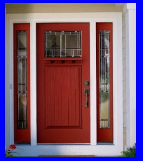
Deep Red
If you love the color red anyway, this is a very traditional color to paint on your door. The color, which is similar to a cinnamon red color, has a deep red look to it, but with undertones of orange and burnt umber. If you really want to create an outstanding color using this paint, make sure that you first use a tinted primer on the door, and then paint over it with THREE coats of this paint. This process will give the color a sense of depth, and the high gloss paint will give it a really sexy shiny look that looks amazing. Add in some brass for the door knocker, knob and kick plate and you have an amazingly dreamy door that any traditionalist would love.
Yellow Bright
Okay so yellow is not a commonly used traditional color, but it still is traditional when it comes to the body of the house, so why not the door? This color of yellow - Benjamin Moore Sunburst 2023-40 is bright and yet not neon bright. It’s sort of lemon chiffon meets summery sun. It’s bright, but not too bright and it looks amazing with a white trim house. White and yellow sort of just fit into each other so well. This color is also very versatile because it looks great in fall - with all the colors of the leaves falling from the trees. It looks great in summer with the flowers blooming in your front garden and the green grass. It even looks great in dreary snowy winter because it helps brighten the space up!
Deep Blue
This is almost so dark; it could be considered a navy blue. The color, appropriately enough, is by Benjamin Moore and its called Evening Sky 833. This color looks almost like the navy blue ink from an ink pen, mixed with undertones of black. In fact, if you stare at it enough you begin to think it’s turning from blue to black it’s so dark - and yet a very beautiful color. This would look great on a natural stone house, or maybe a silvery shingled Cape Cod home. Silver and blue go really well together. Also, since it is blue and if you have a waterfront home, Cape Cod home or beach cottage, this blue goes really well with the color of sand and greenery, but also symbolizes the water in the area.
Pumpkin!
I absolutely love this color and I’ve seen it placed on many different homes. In the case of the front door, it has a very appealing feel and look to it. It’s almost like a deep brown with an undertone of red and yellow mixed in. It’s not for everyone and it’s a very daring color, but pick the right body color and trim color and you could have the best looking house on the block. Personally, I really like this Pumpkin Benjamin Moore Gold Rush 2166-10 color with a gray blue body and white trim. It just fits, it sounds odd, but it fits perfectly well.
